
This really shouldn’t be this difficult
I’m old enough to remember having to creating nesting tables in order to get decent looking web layouts. I also remember almost having a nervous breakdown trying to find where you didn’t close and table cell tag somewhere in a sea of never ending, nested html tags, sometime nested 7 or 8 tables deep. Good times.
One of the things that I did like about tables was the alignment options for cells. It was extremely easy to center content vertically in a <td> tag just by setting some up a simple attribute valign=”center”. Boom! Done. I always wondered why there wasn’t really a similar vertical-alignment CSS style rule for elements that worked as simply for <div> tags. There is a CSS rule VERTICAL-ALIGN but it doesn’t work the same as the table attribute. Vertical centering is something people would want to do all the time. Displaying an image centered in the middle of a <div> container, perfect use case and a pain in the ass to accomplish. I have often just used a table with a single cell to vertically align something after getting frustrated trying to do it without tables.
The DISPLAY options TABLE and TABLE-CELL appeared but I never really got them to work the way I wanted. Maybe I was just doing it wrong, it wouldn’t be the first time. I’ve created an entire art form from doing it wrong. I also read about a million ways of nesting containers in other container with different margins and style rules. That didn’t seem like a big improvement over the table nesting strategy.
Then came along the DISPLAY option FLEX and things got a whole lot easier. If you’re already familiar with this DISPLAY option then move along. There’s nothing new for you to see here. If you’re not familiar with FLEX then read on, you might discovery something useful.
Flexbox Layout is the actual name of the WC3 Candidate Recommendation. It’s purpose is to provide a more efficient way to lay out, align and distribute space among elements in a container even when the height and/or the width of the container may be unknown. It has a lot more functionality then the simple application I’m going to describe here, but this is just a quick tip 😉
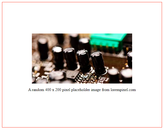
For this example lets pretend we have a <div> element on our page that will have an unknown height. We want to display an image and a paragraph of text below that image and make sure all the content is vertically aligned in the center of the <div> container.
This is the HTML snippet for our example:
Simple HTML. A DIV with a class of container with two child elements; an image and a paragraph of text.
<div class="container">
   <img src="https://lorempixel.com/400/200/" alt="random 400x200 placeholder image from lorempixel"/>
   <p>A random 400 x 200 pixel placeholder image from lorempixel.com</p>
</div>
The CSS
Here is the CSS class to assign to our container. I’ve added height and border attributes for demonstration purposes. It will allow you to easily change and see the height of the container to test that the content does stay vertically aligned.
.container {
  display: flex;
  align-content: center;
  flex-direction: column;
  height: 500px;
  border: solid 1px red;
}
.container img {
  align-self: center;
}
.container p {
  text-align: center;
}
We are setting the display mode to flex, setting the content-alignment rule to center, and the flex direction to column. If you don’t set the direction the items will be displayed next to each other instead of stacked vertically. The flex-direction rule defaults to row. The extra style on the image is to prevent the flex layout from stretching the image to fit the container which is the default for align-self (stretch).
The result:
Complete Example
Here is the complete HTML file I used to generate the above results if you would like to experiment with the various options for Flexbox. The CSS Tricks website has a great article on everything Flex. Check it out if you want to see how else this feature can make your life easier.
<html lang="en">
<head>
  <meta charset="UTF-8">
  <meta name="viewport" content="width=device-width, initial-scale=1.0">
  <meta http-equiv="X-UA-Compatible" content="ie=edge">
  <title>Center content vertically in a div element using flex</title>
  <style>
    .container {
      display: flex;
      align-content: center;
      flex-direction: column;
      justify-content: center;
      height: 500px;
      border: solid 1px red;
    }
    .container img {
      align-self: center;
    }
    .container p {
      text-align: center;
    }
  </style>
</head>
<body>
  <div class="container">
    <img src="https://lorempixel.com/400/200/" alt="random 400x200 placeholder image from lorempixel"/>
    <p>A random 400 x 200 pixel placeholder image from lorempixel.com</p>
  </div>
</body>
</html>
~Rob